Cluster: Interior Design & Decor | Content Type: Best Practices | Search Intent: Informational | Audience: Intermediate | Funnel: Top of Funnel
Low-light rooms usually look better when paint is chosen for the light the room actually receives, not for how a swatch looks in a store. Warm off-whites, light greiges, muted creams, gentle clay tones, and selected mid-tones can all work well when their undertones and reflectance suit the space.
TL;DR Start with the room’s direction and artificial lighting, then compare undertones and light reflectance value (LRV). Sample several candidates on more than one wall and view them morning, afternoon, and evening. A brighter color can help bounce available light, but a deliberately darker color can also create a cohesive, comfortable room when brightness is not the goal.
Start With Light Behavior Instead of a Color Name
A room can feel dim for several reasons: small windows, deep overhangs, trees outside, a north-facing exposure, dark flooring, or simply limited electric lighting. Those conditions change how paint is perceived. Before narrowing a palette, stand in the room at different times of day and note whether the available light reads cool, warm, greenish, gray, or strongly directional.
Paint manufacturers commonly publish light reflectance value, or LRV, as a way to describe how much visible light a surface reflects. Sherwin-Williams explains LRV and room orientation and notes that higher-LRV colors can be useful in rooms with cooler, limited daylight. LRV is a helpful screening tool, but it is not a guarantee that a color will feel bright. Finish, surrounding surfaces, window exposure, and lamp color all affect the result.
Color Families That Often Work in Dim Rooms
Warm off-whites and soft creams
Warm whites are a practical starting point when the goal is to make the room feel lighter without turning stark. A small amount of cream, beige, or muted yellow can soften blue-gray daylight. The exact undertone matters: a white that looks clean in a sunny room may appear flat or chilly in a shadowed room, while a warmer white can feel more balanced.
Light greige and warm gray
Greige can bridge cool light and warm furnishings because it carries both gray and beige. In a low-light room, very cool gray may look more blue than expected, so a warmer gray or greige is often easier to coordinate with wood, natural textiles, and warm-white lamps. This is a design preference rather than a universal rule, so samples are essential.
Muted blush, clay, and pale terracotta
Soft earth tones can make limited light feel intentional rather than deficient. Muted blush and clay-based colors are particularly useful when the room contains warm wood, brass, tan upholstery, or woven textures. Keep saturation restrained if the room is small and the desired effect is calm rather than dramatic.
Gentle green and softened blue-green
A quiet sage or gray-green can work in a dim room when it relates to surrounding finishes. Green undertones are especially sensitive to outdoor foliage and nearby colored surfaces, so test them on more than one wall. If the room already receives cool light, a strongly blue green may intensify that coolness.
Deliberate mid-tones and deep colors
Light paint is not the only valid answer. If a room will never read as bright, a mid-tone taupe, olive, charcoal, or muted navy can create a more enveloping atmosphere. This approach is subjective and works best when the lighting plan, trim color, and furnishings support it. The goal changes from “make it brighter” to “make the low light feel designed.”
Match Paint to the Room’s Artificial Lighting
Wall color and lamp color interact throughout the evening. The U.S. Department of Energy describes correlated color temperature as the color appearance of a light source, commonly ranging from warmer to cooler white light. Its guidance on light-bulb color temperature is useful when evaluating how warm or cool a room may read after sunset.
If the paint still feels wrong after sampling, the issue may be the lighting arrangement rather than the wall color. A room that relies on one central fixture can create dark corners and harsh contrast. A more layered approach is covered in this room-by-room smart lighting setup, where ambient, task, and accent sources can be coordinated instead of asking the paint to solve every visibility problem.
Use a Repeatable Sampling Process
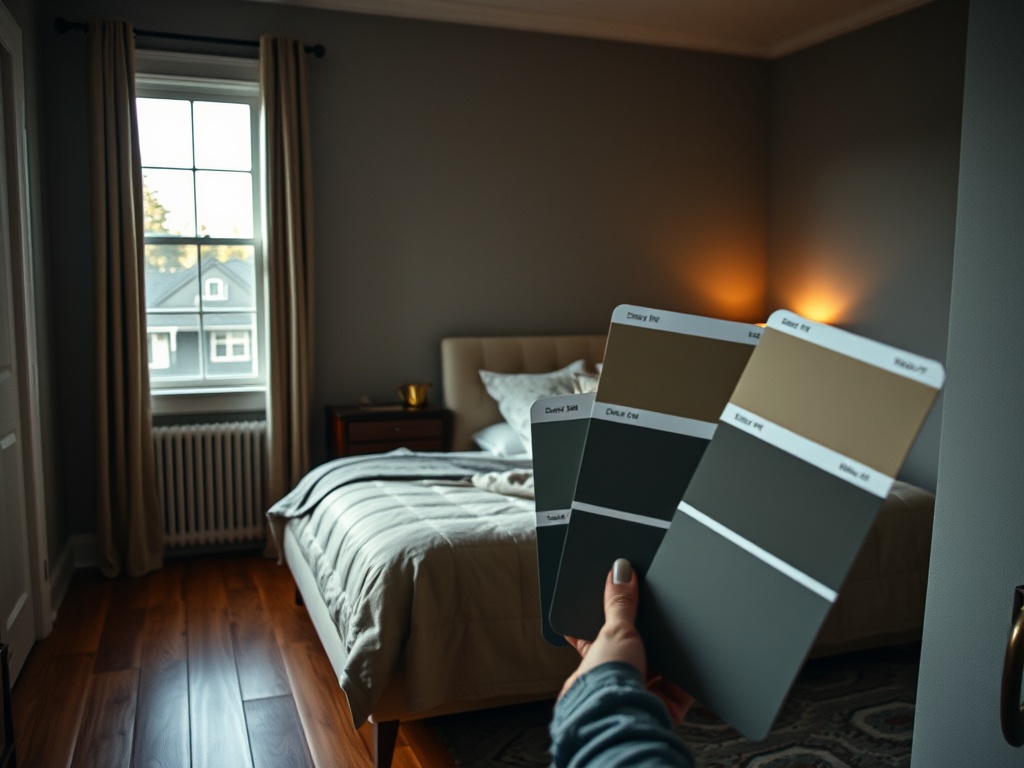
1. Choose three to five candidates with different undertones rather than five nearly identical chips.
2. Paint large sample areas or movable sample boards so you can compare the colors on different walls.
3. Check the samples in natural daylight, on overcast days if possible, and under the room’s normal lamps after dark.
4. Compare the paint against fixed finishes such as flooring, counters, tile, large furniture, and trim.
5. Eliminate any color that turns noticeably muddy, green, pink, purple, or blue in a way you do not want.
6. Only then compare finish and sheen, because sheen can change how much light a surface appears to return.
Avoid choosing from a phone screen alone. Digital color representations vary by display settings, brightness, and surrounding light. Manufacturer sites themselves commonly advise testing physical samples. A sample board is especially useful for renters or for anyone who wants to move the color around without painting many patches on finished walls.
Common Mistakes That Make Low-Light Rooms Harder to Finish
- Choosing the brightest white available without checking undertones. A high-reflectance white can still feel cold or stark in weak light.
- Assuming every north-facing or interior room needs beige. Some cool colors work beautifully when the furnishings and lighting support them.
- Ignoring the ceiling and trim. Strong contrast can visually chop up a small or dim room, while a softer transition may feel calmer.
- Judging color from one wall. The wall opposite a window may read very differently from the wall beside it.
- Trying to solve a storage or layout problem with paint alone. Visual clutter absorbs attention even when the wall color is light.
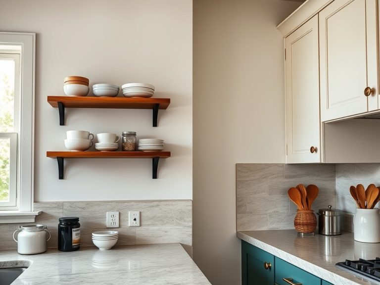
If low light is only one part of the problem, combine color decisions with physical organization. Small bedroom storage ideas can reduce visible clutter and free wall and floor area, while a thoughtful kitchen storage plan may help you decide whether open shelving or upper cabinets better supports the look you want.
Choose for the Room You Actually Live In
The best paint colors for low-light rooms are not a fixed list of shades. They are colors that remain pleasant under your daylight, your lamps, and your permanent finishes. Use LRV to narrow the field, but let full-size samples and real viewing conditions make the final decision. If you want brightness, lean toward higher-reflectance warm or balanced colors. If you want atmosphere, consider richer mid-tones and build the lighting around them.
| Next step: photograph the room in daylight and after dark, collect three to five physical paint samples, and test them before purchasing enough paint for the full space. |
|---|
| Informational note: Interior color recommendations involve subjective design judgment. Always follow paint-manufacturer preparation, ventilation, application, and safety instructions for the specific product you use. |