Good resort wayfinding is less about adding more signs and more about helping guests make the right decision at the right moment. Common failures come from unclear arrival sequences, inconsistent naming, inaccessible routes, and layouts that force guests to backtrack between rooms, amenities, and services.
TL;DR: Treat wayfinding as a complete guest journey: arrival, check-in, vertical circulation, guestrooms, dining, recreation, event spaces, and departure. Test routes with first-time users, keep terminology consistent, maintain accessible paths, and use signs as support for a legible layout rather than a repair for a confusing one.
Wayfinding problems often begin before the first sign
A resort can have attractive graphics and still be hard to understand if entrances, paths, elevators, room numbering, or amenity zones do not create a clear mental map. Accessibility is also a functional requirement, not a styling preference. The ADA lodging guide for guests who are blind or have low vision emphasizes specific directions, accessible movement through a property, and compliant signage in covered facilities, while the 2010 ADA Standards provide technical requirements for accessible routes and signs.
Mistake 1: Designing the map after the buildings are fixed
When circulation is treated as a graphics task at the end of design, signs are asked to solve structural confusion. Long dead ends, hidden elevators, competing entrances, and amenities placed behind private-looking thresholds cannot be fully corrected with arrows. The result may be a property that requires constant staff explanation.
Review guest routes during planning and renovation, not only after opening. Map the shortest intuitive path between arrival, reception, rooms, major amenities, accessible facilities, and emergency exits. Where the architecture cannot change, use lighting, sightlines, landmarks, and staffed touchpoints to reduce ambiguity.
Mistake 2: Using inconsistent names for the same destination
A ballroom called one name on the reservation email, another on the lobby sign, and a third in the mobile app creates avoidable doubt. Resort campuses are especially vulnerable because restaurants, pools, towers, villas, and event zones may have marketing names. Consistency also matters before arrival: prepaid booking risks are easier to manage when confirmations and rate terms use clear, stable wording.
Create a single naming register for buildings, floors, amenities, meeting rooms, and transportation points. Use the same words across signs, maps, apps, staff scripts, and pre-arrival messages. Avoid informal nicknames unless they are clearly secondary.
Mistake 3: Forcing all guests through the same route
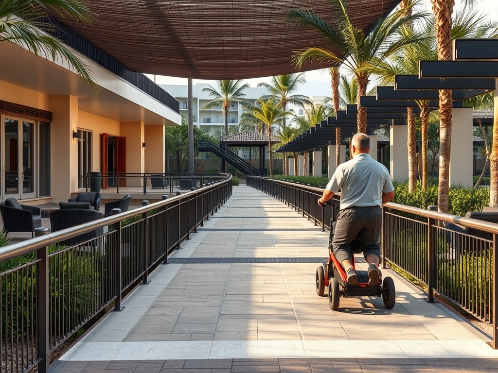
Families with strollers, guests using mobility devices, conference groups, luggage-heavy arrivals, service staff, and pool users may need different paths. A route that looks short on a plan can be difficult if it includes steps, narrow turns, heavy doors, steep grades, or long outdoor exposure.
Evaluate routes by effort as well as distance. Confirm that accessible paths connect the destinations guests are expected to use, and make the accessible route easy to find rather than treating it as a hidden alternative.
Mistake 4: Overloading signs with choices
A sign listing every possible destination can slow decisions at the exact point where guests need one clear cue. Dense directories are useful at orientation points, but intersections usually need prioritized direction. This is one reason hotel technology adoption should support physical wayfinding instead of replacing it outright.
At each decision point, show only the destinations relevant to that branch. Use a hierarchy: major zones first, then local destinations. Keep arrows, naming, icons, and placement consistent so guests learn the system as they move.
Mistake 5: Ignoring the return journey
Design teams often test the route from lobby to room but not from room to breakfast, pool to restroom, spa to elevator, event room to rideshare pickup, or beach to accessible entrance. Guests experience the property as a network of repeated trips, not a single arrival path.
Run route tests in both directions and at different times of day. Include low-light conditions, weather-protected alternatives, closed venues, and busy periods. The same discipline helps travelers understand meal-plan choices and where inclusions apply because dining locations must be findable as well as included.
Mistake 6: Skipping first-time-user testing
People who work at a resort stop seeing ambiguity because they already know the shortcuts, hidden doors, and local terminology. Internal teams can therefore approve a system that feels obvious to insiders but confusing to new guests.
Test with people who have not seen the plan. Give them realistic tasks without coaching, observe where they pause or turn back, and record repeated failure points. Use those observations to change the route, cue, or information placement rather than blaming the user.
How to repair a confusing guest route without rebuilding the resort
When a property is already operating, the goal is to remove the highest-friction decisions first. Small changes can help when they are based on observed behavior rather than decorative preference.
- Identify the routes that generate the most questions, missed appointments, late arrivals, or staff escorts.
- Fix naming conflicts across physical and digital touchpoints before adding new sign types.
- Improve sightlines and decision-point cues, then confirm that accessible alternatives are equally clear.
- Retest with first-time users and frontline staff, and keep a log of recurring confusion after changes go live.
A first-time guest test for resort circulation
Wayfinding decisions are easier to evaluate when the team stops thinking like an operator and starts thinking like a first-time guest. Test the property as a sequence of real tasks, including the moments when people are tired, carrying luggage, moving in bad weather, or looking for an accessible alternative.
Pay special attention to places where guests stop even though no formal decision should be required. Pauses near elevator banks, landscape paths, identical corridor junctions, or large open lobbies often reveal that the environment lacks a strong orientation cue. Repeated hesitation is useful evidence because it shows where the layout, landmark, lighting, naming, or sign hierarchy should do more work.
- Can a guest identify the primary arrival point before reaching the building? Test vehicle approach, pedestrian approach, rideshare drop-off, parking, and shuttle arrival so competing entrances do not create uncertainty before check-in.
- At every major intersection, is the next decision visible early enough to act? Guests should not need to walk past a turn, stop in a doorway, or reverse direction because the cue appears only after the decision point.
- Do physical signs, digital maps, pre-arrival messages, and staff descriptions use the same names? A single naming system reduces the mental work required to connect what a guest saw online with what appears on property.
- Is the accessible route presented as a normal route rather than a special detour? Check slope, doors, elevators, surface changes, lighting, weather exposure, and the clarity of directional information along the entire path.
- Can guests find their way back from amenities without relying on memory? Test routes from pools, beaches, restaurants, meeting rooms, spas, and recreation areas to rooms, restrooms, elevators, and transportation pickup points.
- What questions are staff answering repeatedly? Frontline questions are a practical dataset. Cluster them by location and time of day, then fix the route or cue that creates the question instead of simply scripting a better answer.
Make the property explain itself
The strongest wayfinding system feels almost invisible because guests can predict where to go next. Prioritize legible circulation, accessible routes, consistent names, and timely cues; use signage to reinforce those choices, not to compensate for them.